Our work
Every design starts with the problem a type of business has online. These are our own design studies, one per industry: click through the live demos, see them on a phone, and use any of them as the start of your website.
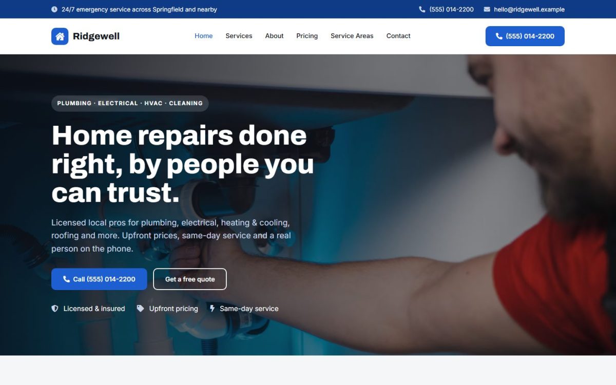
01 · Home services
The brief
A homeowner with a burst pipe doesn’t browse. They need to trust you in seconds and call you right away.
Our approach
A calm blue that reads as reliable, and the phone number in four places: top bar, header, hero and every call to action. Services, fixed prices and service areas each get their own page, so people find their answer without scrolling.
Type: Archivo & Inter
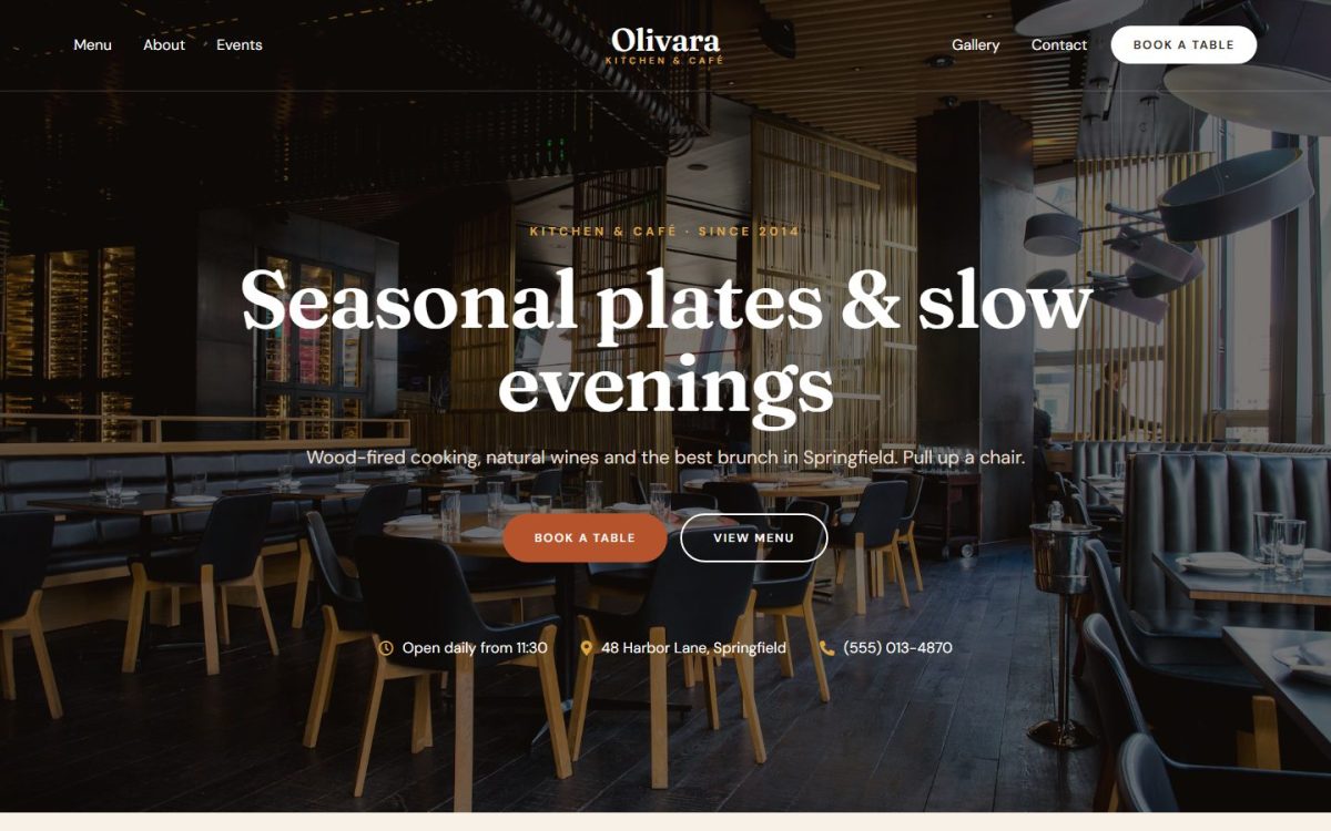
02 · Restaurant & café
The brief
People choose where to eat on their phone, often on the way. They want the menu, the hours and a table, fast.
Our approach
Warm serif type and arched photos give a neighborhood-kitchen feel. The menu reads like a printed one, with dotted leaders and prices. Booking a table is never more than one tap away.
Type: Fraunces & DM Sans
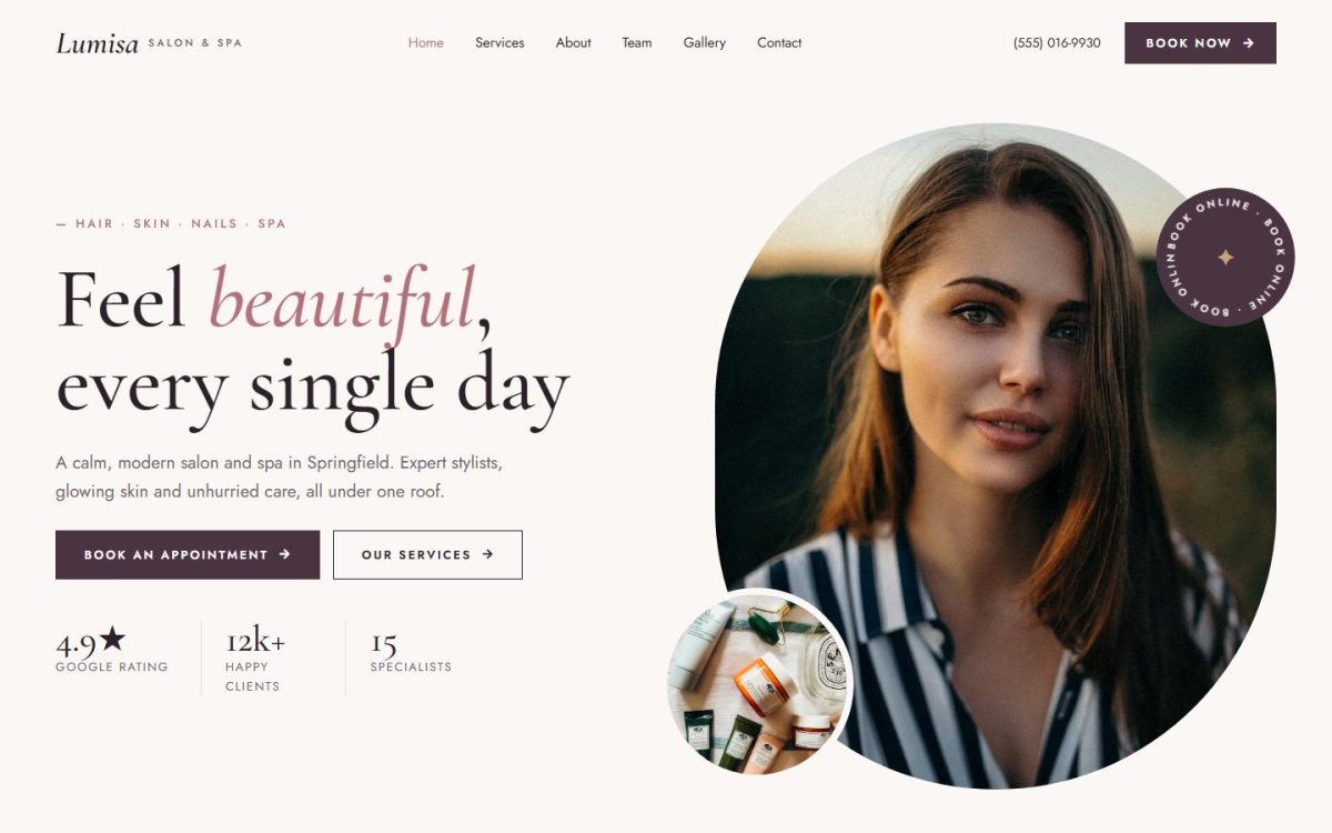
03 · Beauty salon & spa
The brief
Salon clients buy a feeling as much as a service. The site has to feel calm and premium, and make booking easy.
Our approach
Plum and rose with italic serif accents, rounded capsule and circle photo frames, and a slowly rotating “book online” badge. Prices sit in clean rows so nobody has to ask.
Type: Cormorant Garamond & Jost
04 · Coach & consultant
The brief
Most coach websites look the same. A personal brand needs a face, a clear offer and a reason to book a call.
Our approach
A bold, confident look: black outlines, hard shadows and a lime highlighter on the words that matter. Programs show prices up front, and a free guide turns visitors into email subscribers.
Type: Bricolage Grotesque & Manrope
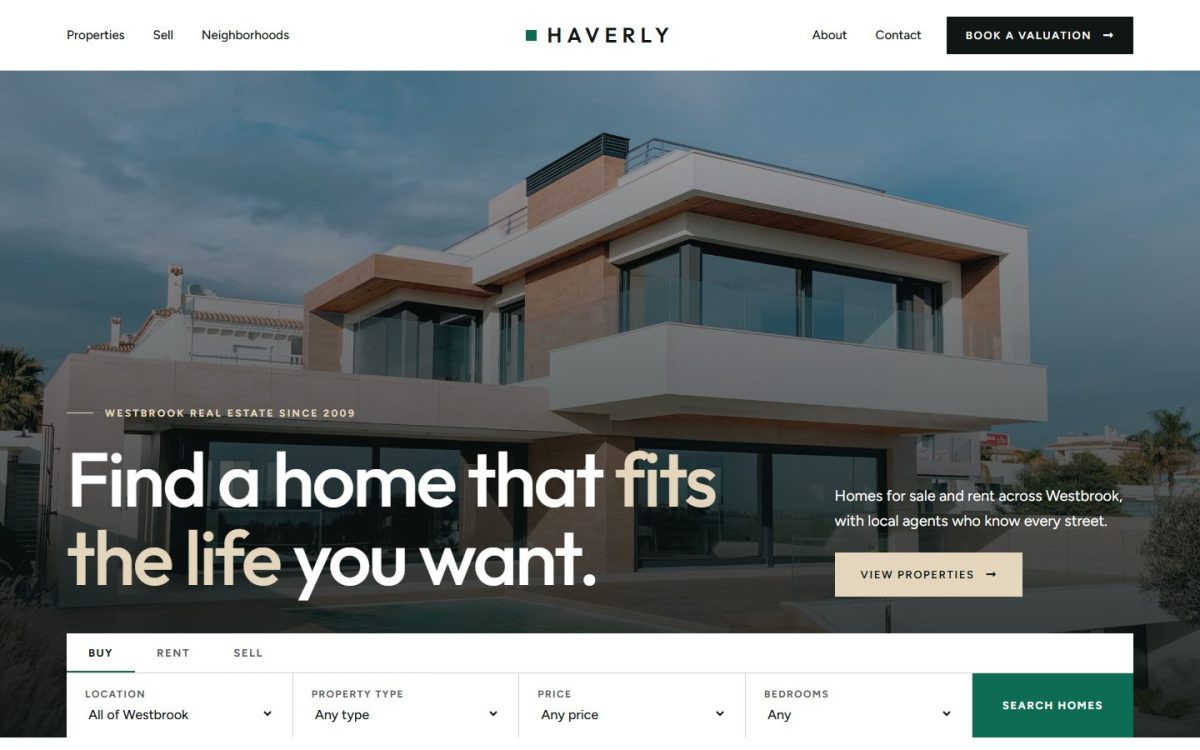
05 · Real estate
The brief
Buyers want to browse homes. Sellers want to know what their home is worth. One site has to serve both.
Our approach
A quiet emerald and stone palette with square corners and lots of space, so the homes are the hero. Property cards carry clear spec strips, and a valuation form waits on every page.
Type: Outfit & Figtree
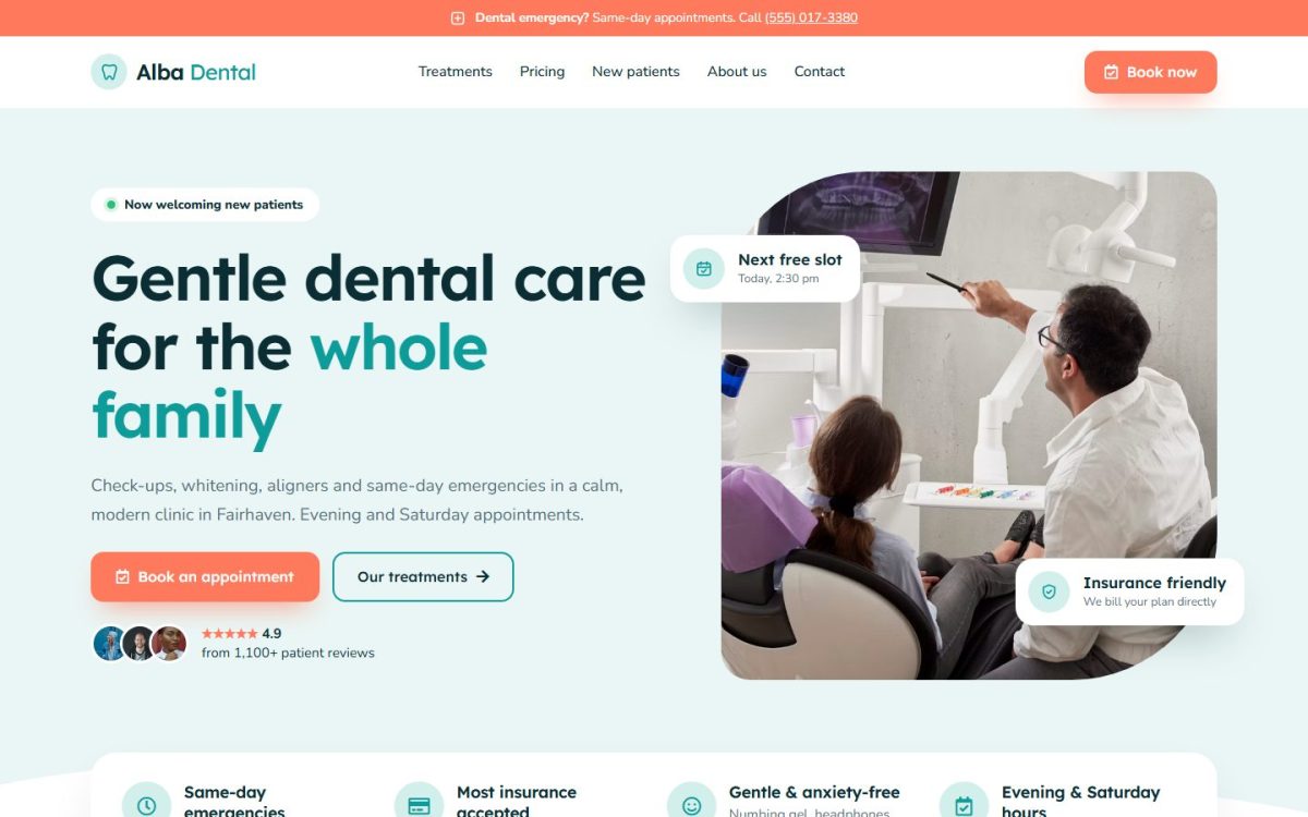
06 · Dentist & clinic
The brief
Many people are nervous about the dentist. They need reassurance, prices, and an answer to “can you see me today?”
Our approach
Soft aqua and coral, gentle waves and rounded leaf-shaped photos. Floating info cards answer the big questions early: next free slot, insurance, emergencies.
Type: Lexend & Nunito Sans
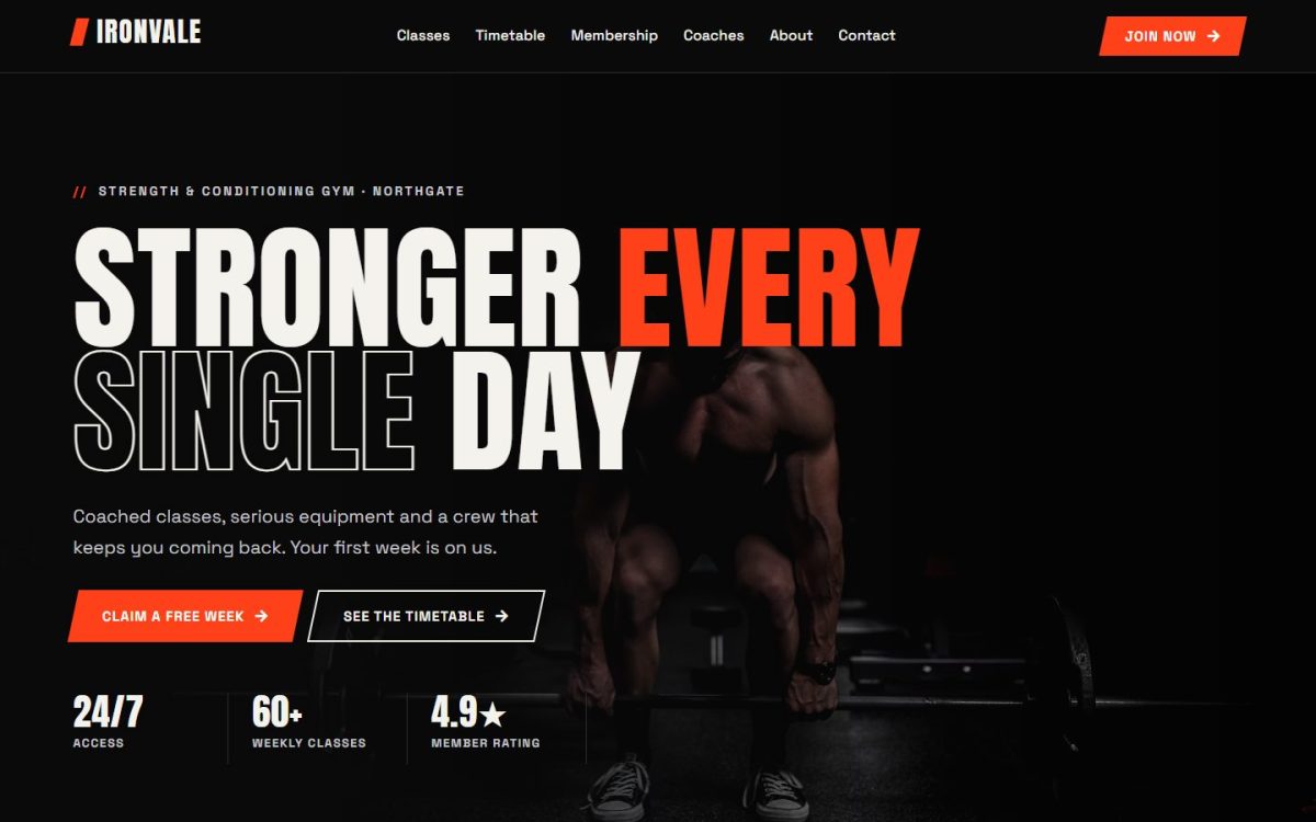
07 · Gym & fitness
The brief
A gym sells energy and commitment. Visitors want the classes, the timetable and the price, then a free trial.
Our approach
Dark backgrounds with a blaze-orange accent, tall condensed type, skewed buttons and slanted section edges. A full weekly timetable and a working BMI calculator keep people on the page.
Type: Anton & Space Grotesk
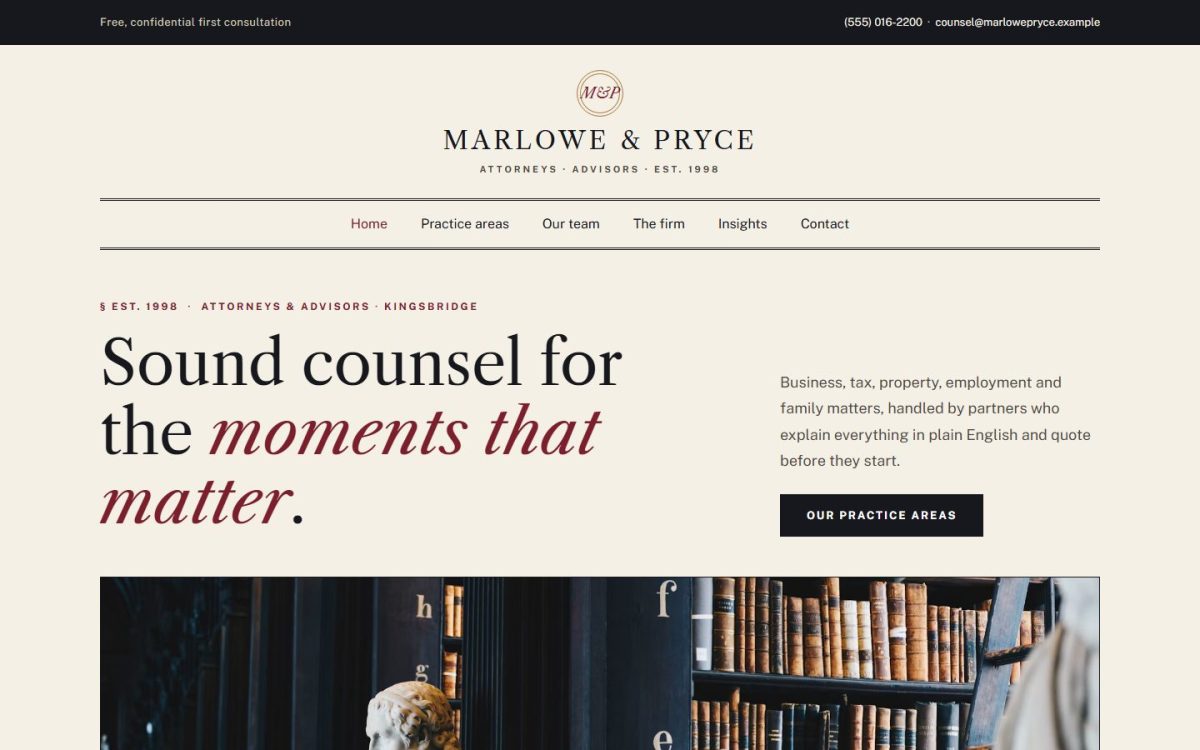
08 · Law & accounting
The brief
Clients of a law or accounting firm need authority and clarity, without the cold, corporate feel.
Our approach
An editorial look: oxblood and parchment, a newspaper-style masthead, double rules and numbered § sections. Practice areas read like a table of contents, with fees shown openly.
Type: Libre Caslon Text & Public Sans
09 · Barber shop
The brief
A barbershop runs on character and walk-ins. People want prices, hours and a barber they like, right now.
Our approach
Barber-pole stripes, a heavy slab typeface, prices on ticket-style cards and an old-school hours board. A small shop page sells the grooming products too.
Type: Alfa Slab One & Work Sans
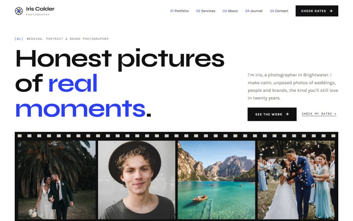
10 · Photographer
The brief
For a photographer the work must lead. Couples and brands also need packages and free dates before they write.
Our approach
A film-strip hero, viewfinder corners on photos and a contact sheet with picks. Clean type and a monospace for captions, and an availability calendar that answers the first question.
Type: Syne & Karla
Want one made for you?
Pick a design you like, or start from scratch. Either way you see a free preview before you pay.
Tell us about your business and get a free preview in a few days.